Project Overview
Visual design has a huge impact on how users experience an interface. In fact, people often prefer beautiful designs so much that they’ll overlook small usability issues. Still, many UX designers have drifted away from the craft of visual design. As one of the few designers in our UX org with a strong visual background, I started a weekly Visual Design Office Hour to help Salesforce designers elevate their work through focused UX/UI feedback.
Here are the four areas I usually cover in these sessions that have consistently improved the quality of projects brought in:
Visual Hierarchy
A lot of designers like to establishing information hierarchy through content positioning on the page. I take their designs to the next level by using visual hierarchy to help guide users to the right places at the right time through the use of contrast, white/negative space, and color choices that draw the eye to catch the right amount of attention.
ROLE
UX / UI Consultant
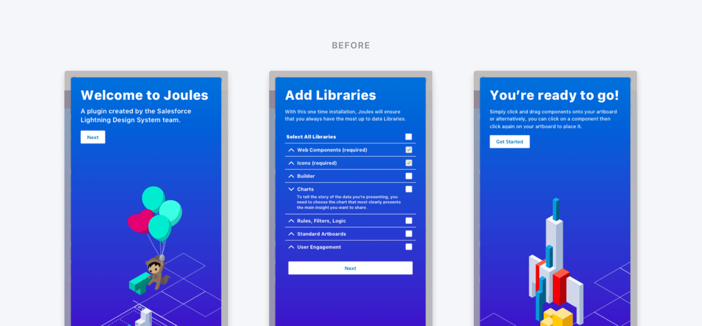
Visual Design Office Hour – Beautiful Works Better!
TIMELINE
Ongoing throughout my time at Salesforce
TEAM
Salesforce Product Design Org
GOAL
To provide UX/UI consultation, helping our designers craft beautiful and highly functional user interfaces.
It's proven that attractive products simply perform better. I'm dedicated to form and function, and that making something beautiful is a key component of creating a better user experience.
From the Desk of YIJING ZHANG : )
Typography
Typography is not something that is usually on the minds of UX designers but updating the font choice, font sizing, or weights sometimes can really make the deliverables more visually appealing and more effective at communicating their message.
Color
Colors are a key part of any visual composition. Each color has its own influence on our mind and the knowledge of the possible reactions can help designers to transfer the right message and call users to make the expected action. For example, red normally symbolizes error, orange for the warning, and green for success.
Illustration
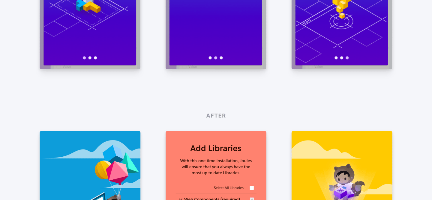
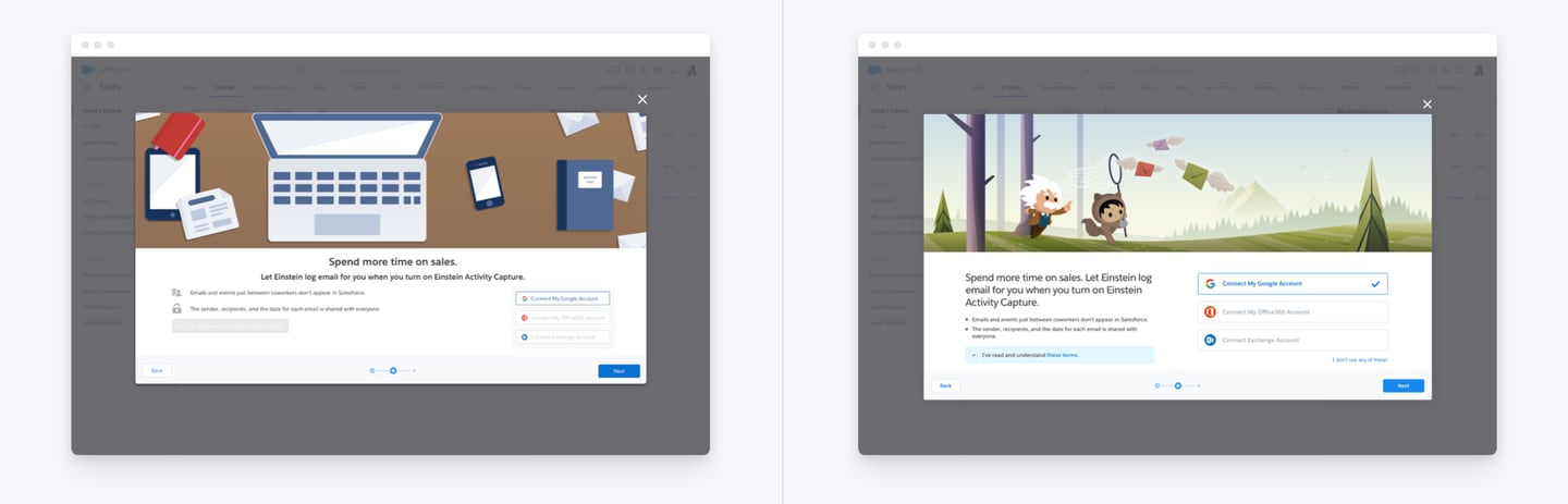
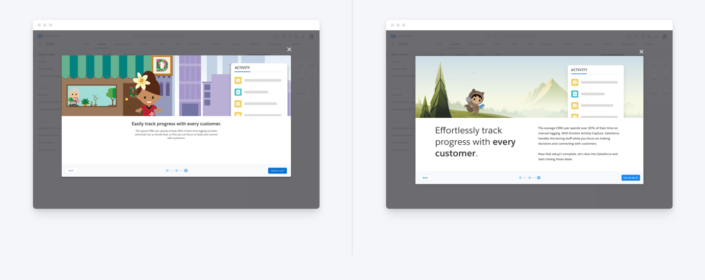
I often end up creating custom illustrations for designers who bring their projects to office hour, illustrations can greatly enhance the look and feel of the UI, and to bring our products to life, it is a powerful tool that complements the content and amplifies the message to the user. However, do keep in mind that illustration without a purpose can be annoying.
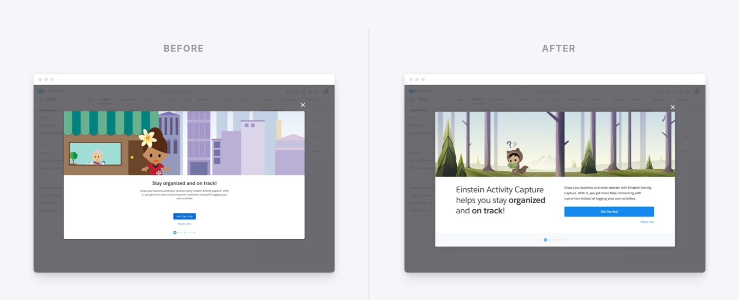
Examples
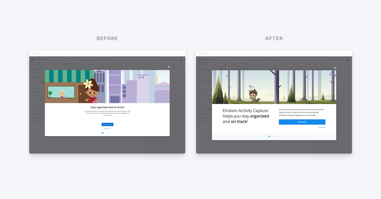
01. Salesforce Einstein Activity Capture Onboarding Flow
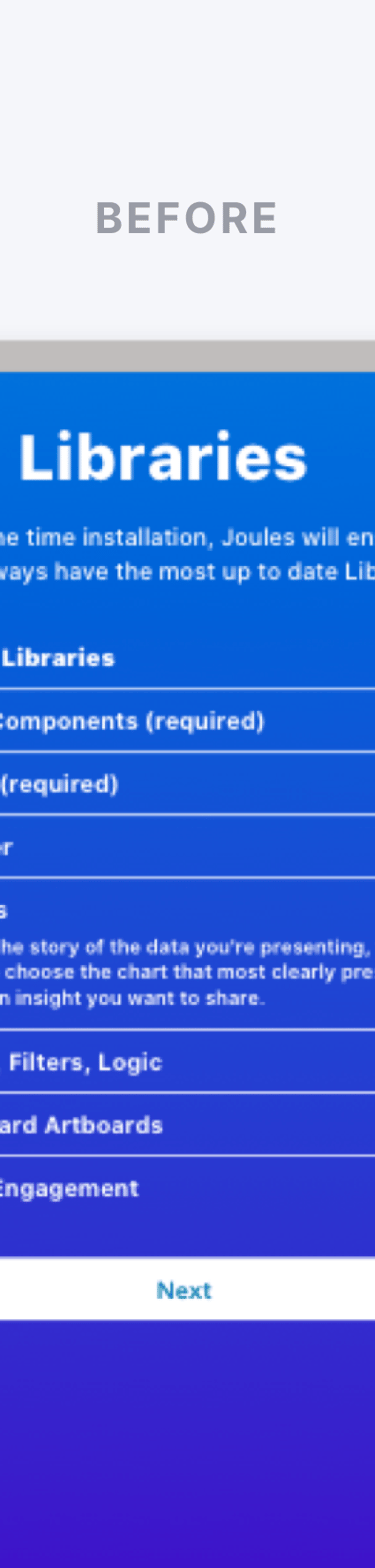
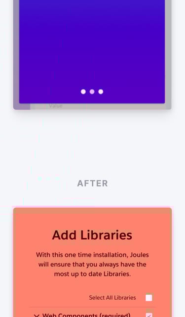
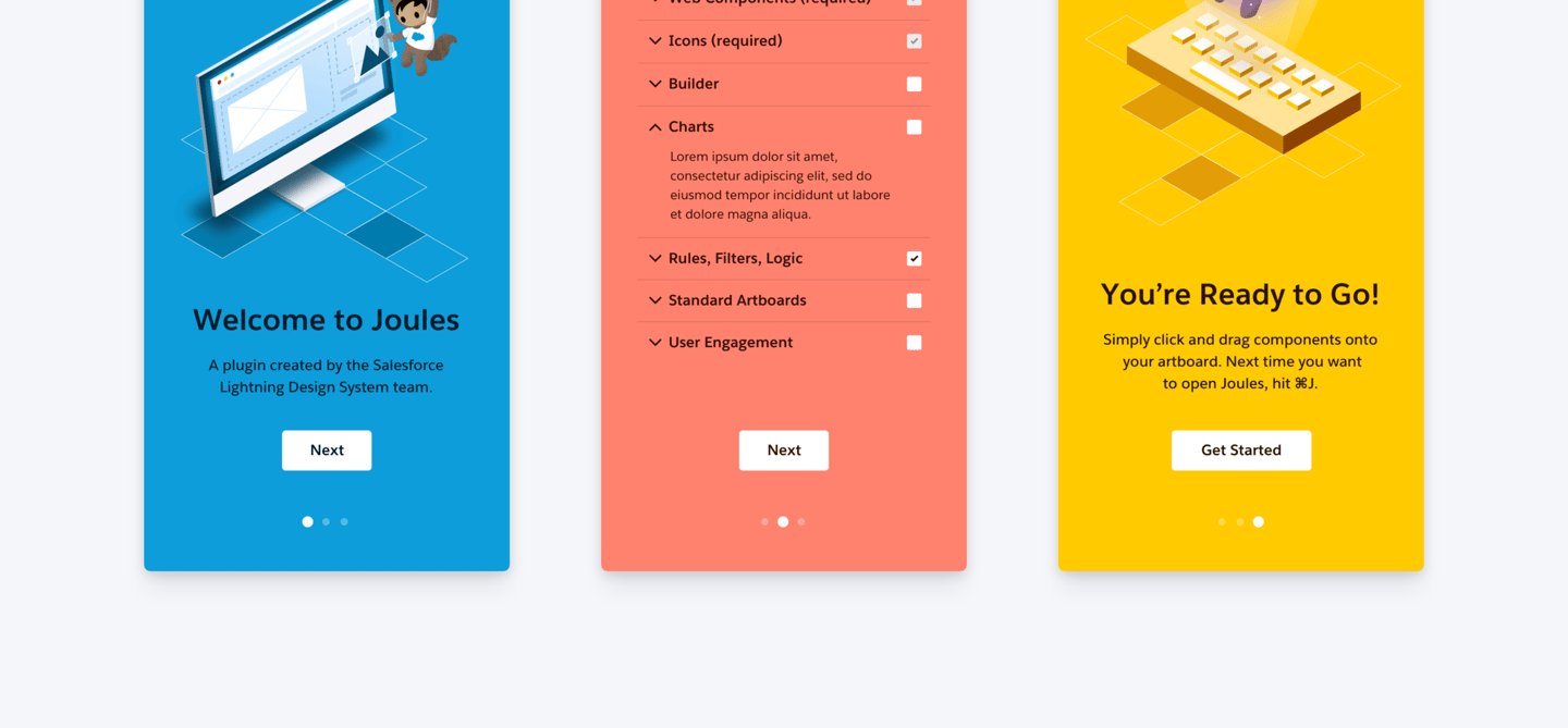
02. Salesforce Joule Sketch Plug-in Onboarding