
Project Overview
An entrepreneur friend wanted to launch an "uber for hair-stylists" – an app for salons and hairdressers to connect with new and existing clients, and build their business. Clients can discover new services and providers, book appointments, and get inspired.
I took the challenge to design the key functionalities for SalonHQ's first release as well as the visual identity that perfectly captures its personality. The product was very different from what I know, unlike the enterprise software that I am familiar with, it needs to be very hip and cool - think Vogue magazine. It was definitely a fun and learning experience, and a chance for me to step out of my comfort zone and be creative.
Developing the Visual Identity
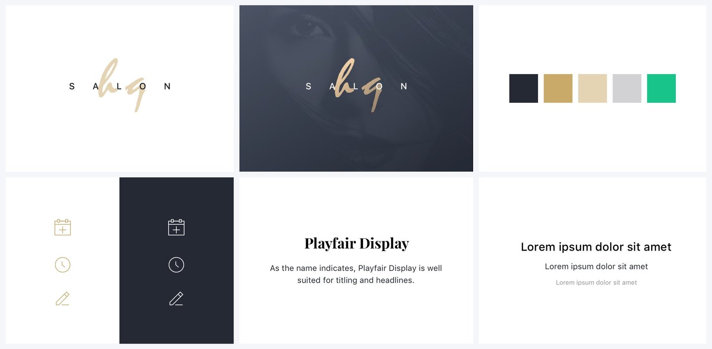
I love getting started by defining the brand's core identity! The wordmark was the first thing I designed, as this small logo is the face of the brand and establishes the very first impression. Through initial conversations with key stakeholders, I gained a clear understanding of the business model and our primary demographic: independent female beauty professionals, primarily aged 30–50, who use SalonHQ to run and grow their small businesses.
With that demographic in mind, I conducted a competitor audit to find our unique fit in the market. I then moved into sketches and typeface studies to build the right visual structure.
Drawing inspiration from fashion magazines, I noted the importance of hand-generated text—a personal touch that conveys passion. I paired this with a clean, modern typeface for balance and a subtle nod to our female audience. We initially selected gold and black for their luxurious, classy feel, which led to the finalized logo.
ROLE
Product Designer, Brand Designer
The Uber for Hair Stylists – SalonHQ Mobile App
TIMELINE
6 weeks
TEAM
SalonHQ Founding team
GOAL
Design a trendy salon-booking app, defining its audience and crafting a bold, modern visual style.
Making Research Resourceful
Facing tight timelines and budget constraints, I couldn't run a formal research study, and deep down, I knew simply relying on "best practices" often leads to lackluster results. Knowing our core customer demographic (30-50 year-old female beauty professionals), I got resourceful!
I posted on social media and sent messages to find and interview candidates within that specific demographic. I was lucky enough to connect with a few people and conducted short, focused interviews using questions like:
What are you trying to get done? (Gather context)
How do you currently do this? (Analyze workflow)
What could be better about how you do this? (Find opportunities)
Key User Insights
These short interviews were incredibly valuable, helping me uncover key user motivations and major friction points.
One common thread was the desire to automate administrative tasks. Users said they spend way too much time managing appointments (booking, rescheduling, canceling, etc.). They would love an automated system so they could spend more time doing what they do best: focusing on their clients!
I spend way too much time playing phone tag just to book and reschedule clients. Honestly, if I had an automated system handling the admin, I could spend hours more each week doing what I love: focusing on making my clients feel amazing.
Monica S. – Hair Stylist
“
I also consistently heard that these small business owners and stylists are actively seeking a solution to sell hair care products via e-commerce. Since many don't have a physical retail location, an online marketplace would provide a fantastic opportunity for additional income.
Now that I feel like I have enough information to run on and start ideating some solutions. We decided to divide the project into two phases. For phase one, we shipped the following features as our MVP, so we can validate whether customers will use the product, then highlight areas of refinement and additional useful features. As for phase two, we focused on the e-commerce function.
Signup flow for the salon/stylists
Signup and booking flow for clients
Plan of Action
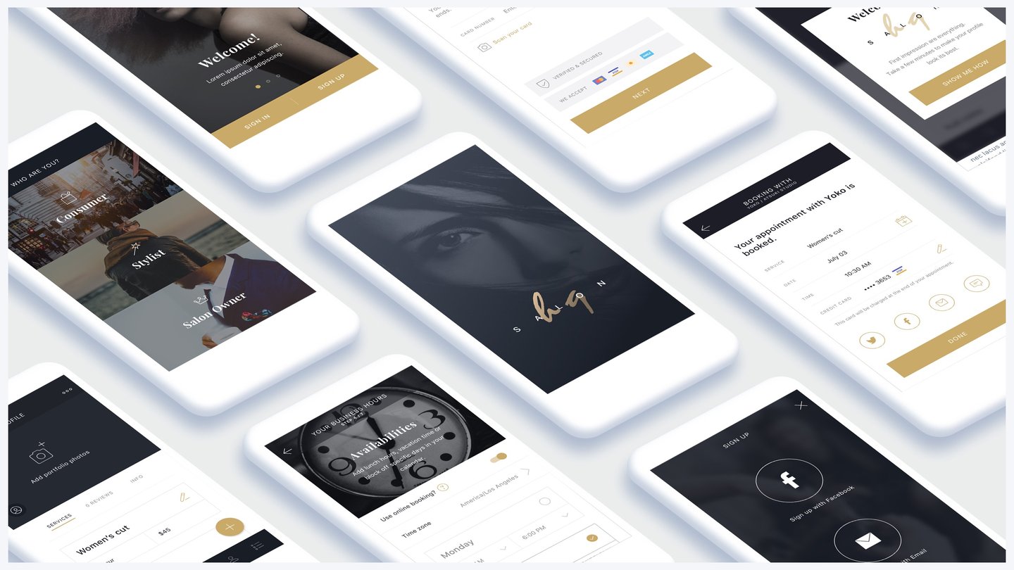
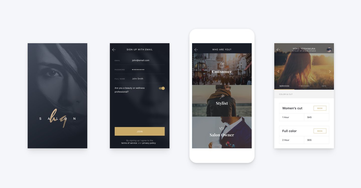
The sign-up flow is arguably the most critical touchpoint in the user journey—it's the very first impression users have of the product! By designing it seamlessly, we can significantly influence how users perceive the product, and ultimately, boost user engagement.
Phase One - Signup
Salon Owners and Stylists Signup Flow
To boost the quality of our signups, I intentionally designed "purpose-driven friction" into the salon owners' and stylists' sign-up flow.
This meant asking for essential details like shop information, service offerings, and availability up front. While it made the process slightly more complex, we believed users who took the time to complete it were far more likely to activate their account and become long-term customers. This approach was also excellent for filtering out spam registrations, leaving us with serious users.
To make this work successfully, every action the user had to take needed to be crystal clear and meaningful. I ensured the process was as simple as practical, so users know what they are signing up for and feel assured in the process. I achieve that from the clarity of design (like labeling form fields clearly), and to communicate the steps of signing up. This is important as clarity builds transparency, and transparency is key to building user trust from the very start.
Phase Two - E-commerce
Learning from the best is an effective way to create something really good. Here we gathered a few of the best e-commerce app designs as our inspiration and applied a lot of the recognition patterns (the common elements familiar to users) into our design. Amazon is one of those examples, it is the biggest marketplaces in the world, and one of the fastest e-commerce on the market, users can easily search for items by applying smart filters, items are presented in the best way, and powerful CTAs engage users to make a purchase.
Based on these industry examples, I applied the following key principles to create an intuitive and simple e-commerce experience:
Effective visual hierarchy
Clean UI design
Smart sales funnel
User-friendly UX solutions
Fast checkout process
Results
With the core UX defined and the product built, we had a solid MVP release that successfully met all our goals. To ensure continuous improvement, we integrated measurement tools directly into features like the sign-up flow. This gives us clear data on user engagement and friction points (where users get stuck). With our goals met and a strong foundation established, we are excited to immediately begin iterating based on near-term usage and continue improving the SalonHQ experience.