
Project Overview
At Salesforce, we're dedicated to our customers' success. After hearing feedback on visual and interaction inconsistencies across our products, our leadership launched a company-wide initiative to improve the user experience. This "Reimagine Empty States" project was my part in that mission: to unify all empty states under one signature voice, creating a cohesive and delightful experience that guides users forward.
The Problem
What’s wrong with how Salesforce uses empty states today?
ROLE
Product Designer / Art Direction
Reimagine Salesforce Empty States
TIMELINE
12 weeks
TEAM
Researcher, UX Engineer, Creative Director, Myself (Design Lead)
GOAL
Unify empty states across all Salesforce products to create a cohesive experience that boosts user engagement.
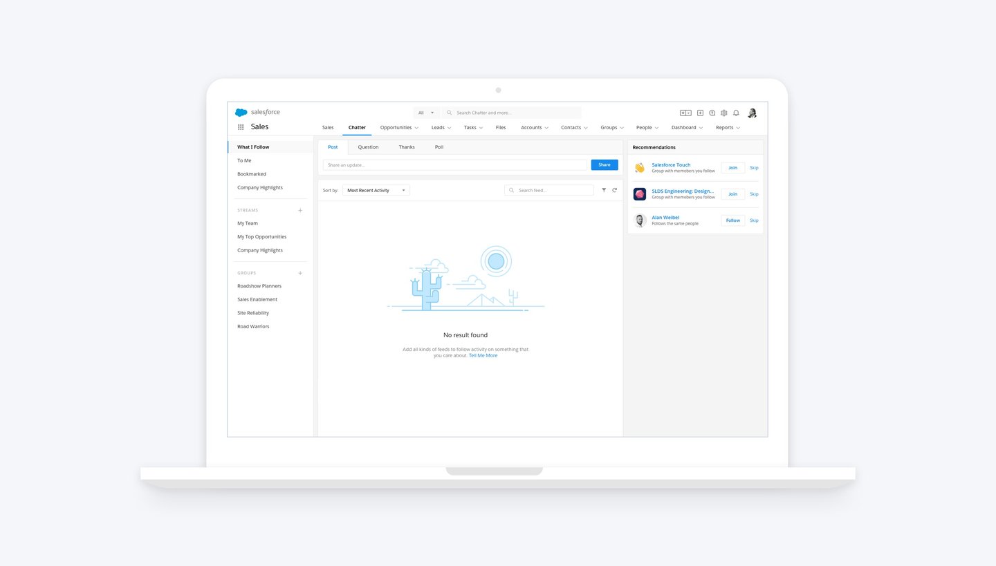
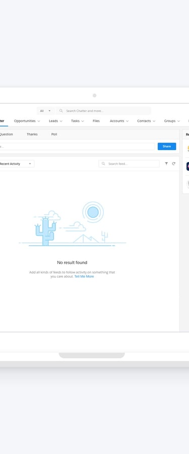
So, what are empty states?
Empty states appear when an element has no content to display. They generally fall into three types – No Data, Informational, and Error.
No Data: When there is no record in the current page or there isn’t any item that needs attention.
Informational: When the system is under maintenance or requires users’ attention.
Error: When a page is not found, the user doesn’t have sufficient privilege or other miscellaneous errors.
In Salesforce, they can appear anywhere – pages, components, menus, or inputs – and may include text, illustrations, links, or a mix, on both desktop and mobile.
• Our usage and expression of empty states is haphazard.
• We miss teaching moments, the chance to educate our users.
• Inconsistent language (formal VS. casual).
• Inconsistent brand expression, not FUNctional.
Bring Salesforce’s unique sense of fun and levity to the product. Work doesn’t need to be boring!
Guy Jenkins – Sr. VP, Platform UX
Proposed Solution
Empty states are a chance to guide and delight users. They should explain what’s happening, why it matters, and what to do next. Whether helping with onboarding, prompting interaction, or easing frustration during an error, a well-designed empty state turns a blank screen into a helpful, reassuring moment.
By running interviews and reviewing past research, I gained a clearer view of user needs and proposed these solutions:
• Educate users to move forward.
• Inject personality, make them fun.
• Express the Salesforce brand.
• Create a pattern, illustration guidelines.
Target Audience
Admins
Empty states are often overlooked, but they play an important role. Admins usually see them while setting up the platform, and if the design isn’t clear, they can get stuck. Improving these moments helps admins move forward with confidence, leading to happier users and lower abandonment.
Designers
Another group of audience is the in-house designers, who are looking for empty state patterns to help them create pleasurable and meaningful experiences.
Design Process
01. Discover and Analyze
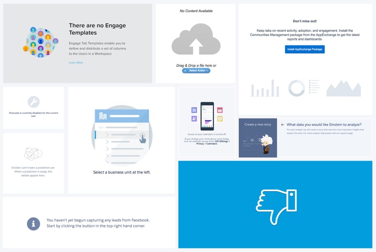
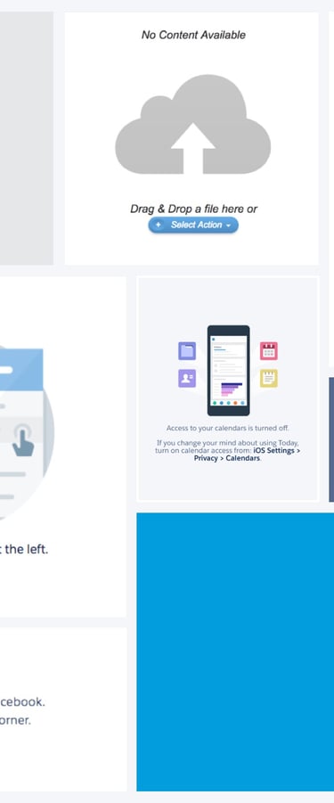
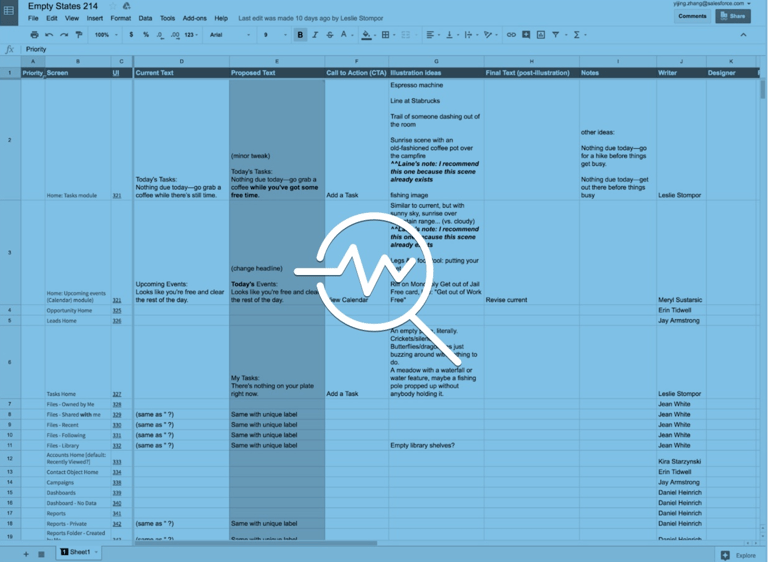
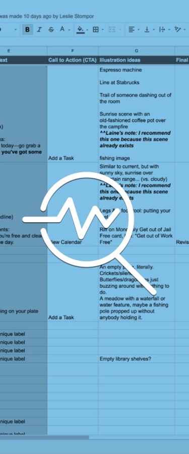
I began with an empty state audit, working with designers across Salesforce to uncover 400+ empty states. Many were duplicates, like multiple versions of “No Access.” My first idea was to consolidate them into a shared library of common patterns.
02. Ideate and Design
Joining forces with a researcher, we analyzed high-exposure empty states to standardize the design's anatomy. To validate the look and feel, we gathered feedback via unmoderated user testing on the illustration style and messaging. This process helped us quickly land on a fun style that aligns perfectly with the Salesforce brand and delights our users.
03. Guideline and Workshop
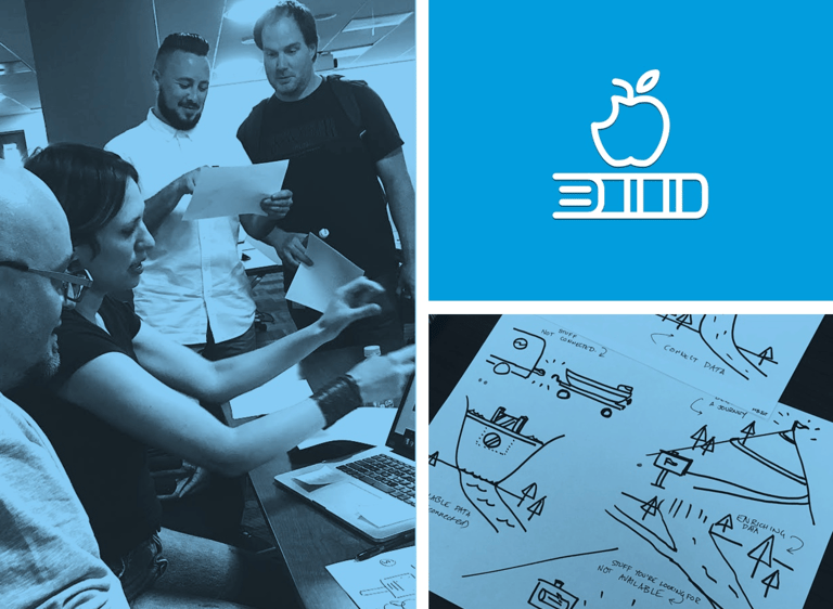
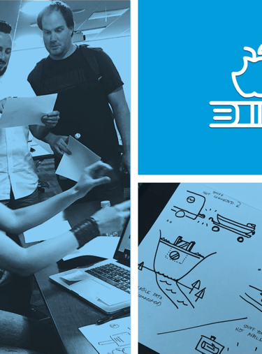
To share our knowledge and empower the team, I developed a step-by-step guideline and hosted a successful workshop for over 20 in-house designers at Salesforce HQ. During the hands-on session, I helped designers brainstorm ideas and practice creating their own illustrations. The best outcome? Many of the illustrations created during the workshop were later used in the product.
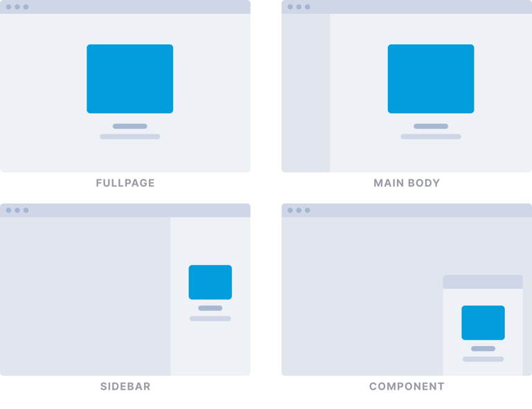
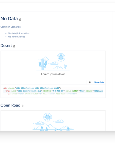
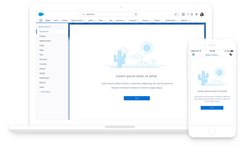
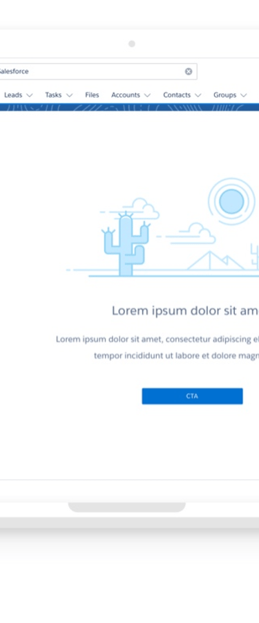
The Anatomy of Empty State
Based on my initial audit, I confirmed that an empty state is typically composed of three key parts: an illustration, a message, and a call-to-action (CTA).
These states can appear anywhere in the product – as a full page, in the main body, sidebar, or inside any component.
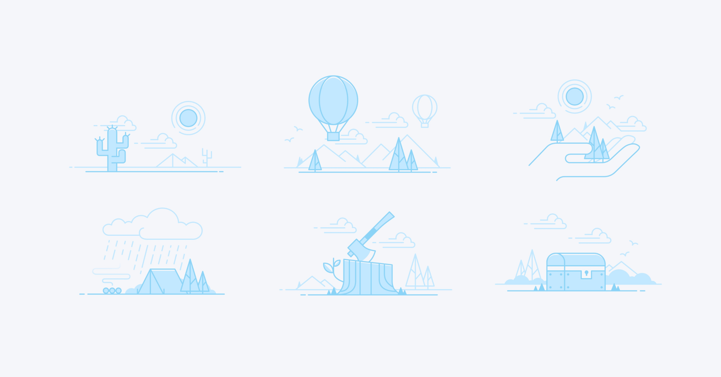
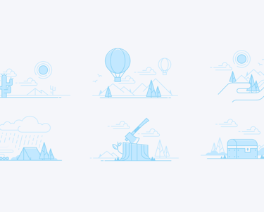
Illustration
Using unmoderated testing with over 100 participants (admins, end-users, and developers), we gathered vital qualitative data on illustration style and messaging.
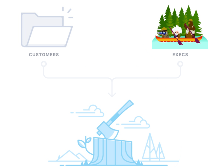
We learned users loved the idea of using more illustrations to make UIs engaging, but they firmly rejected seeing internal Salesforce characters, preferring a subtle style that respected their own organization's branding.
This insight directly contradicted our executive's request for detailed, full-color, Marketing-aligned illustrations. To resolve this, my researcher and I presented the user data to leadership. We successfully guided them away from the strong nature themes toward a new compromise style that satisfied both business goals and customer preference, earning an overall high appeal rating from our users.

Messaging
We conducted qualitative research that showed most users didn't have a strong preference for the empty state's voice and tone. However, some suggested a slightly more light-hearted approach would make the product feel more engaging and fun.
To act on this feedback, I collaborated with a copy writer to set clear rules and bring a consistent, fun voice to the product.
Empty state messages should:
• Concisely describe the state in a fun and engaging way.
• Favor the outdoorsy over the urban (Marketing alignment) Example: "Go for a hike" VS "Go for a walk"
• Ensure image and message in sync
Call to Action
Many existing empty states lacked a Call-to-Action (CTA), which led to user frustration because they didn't know what to do next. To solve this, we mandated that a CTA always be considered. The CTA's purpose is to inform the user's Next Best Action, moving them quickly from an empty state to a valuable experience.
Project Output
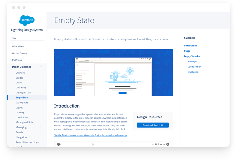
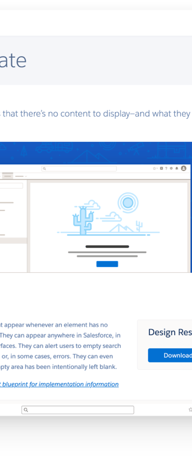
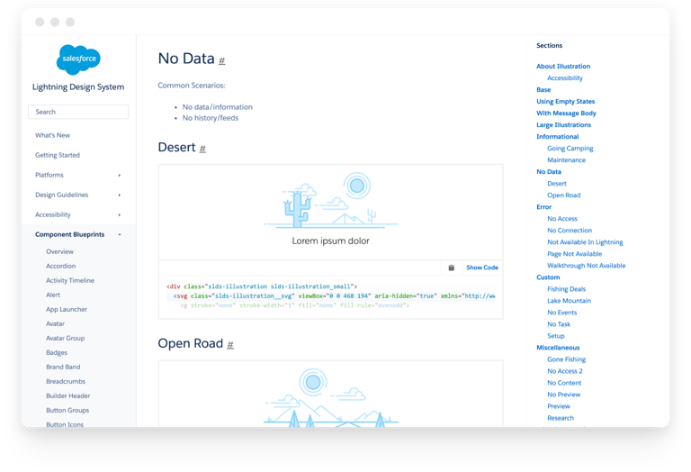
Once our new empty state pattern was designed – one that solved user problems and met our executive and business goals – a Design Guideline (the source of truth) was created.
This guideline allows fellow designers to easily create their own empty states with a unified language and consistent look and feel across the entire Salesforce ecosystem. The complete empty state documentation now lives on the Salesforce Lightning Design System website for easy access.
Design Guideline
Implementation
I collaborated with a UX engineer to create a library of reusable empty state illustration components.
To simplify implementation for engineers, we clearly spec'd out the four different empty state variants (full page, main body, sidebar, and component) using Design Tokens (visual design attributes).
Keeping Mobile in Mind
Since many users frequently switch between desktop and mobile, we needed to ensure our empty states worked perfectly on both.
To allow the components to be shared across form factors, I created two versions of each illustration for the library: a detailed version for large screens and a simplified version for smaller areas. This approach ensured consistency while optimizing for performance and visual clarity on every device.
Animation
During early user interviews, a few participants mentioned that animating some empty states would be "cool." To meet user expectations and up-level the experience, I decided to strategically incorporate subtle animations where appropriate.

For instance, I designed a custom loading animation to replace the typical, boring spinner, adding a touch of delight while the user waits.
Accessibility
Accessibility is always top of mind!


Although illustration technically doesn't need to meet digital contrast ratios like text, I prioritized it anyway. I ensured that the main outlining of our monochromatic empty state illustrations meets proper contrast standards. This step is key to ensuring that people with low vision can clearly distinguish each object depicted, making the designs accessible to users with the most common type of color-blindness.
Results
By re-thinking a ubiquitous problem and basing every decision on user needs, usage data, and business goals, we created a flexible, systematic empty state component. This successfully satisfied our core goals: to unify empty states across all Salesforce products, increase user engagement, and delight users at critical moments.
Thought the illustration style as appropriate and would like to see more.
8/10
20+
DESIGNERS
USERS
Steady increase of designers using the guidelines to create their own empty states.
USER ENGAGEMENT
: )
Noticeable increase in completion rate in various setup flows where empty states were used.