Project Overview
RedPrairie aims to deliver sophisticated and easy-to-use software that helps clients work quickly and efficiently. However, many clients found the existing products' UX/UI to be confusing and outdated. As one of the designers in the team with a strong visual design background, I stepped up to lead the overhaul of the warehouse management app. My objective was clear: give the app a fresh, modern look and feel while bringing its UX/UI up to current accessibility standards.
Proposal
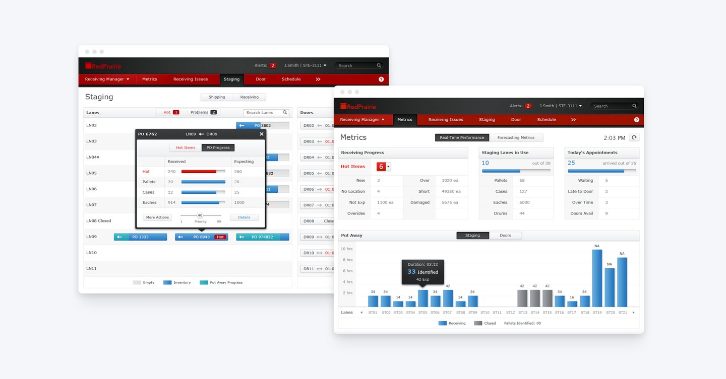
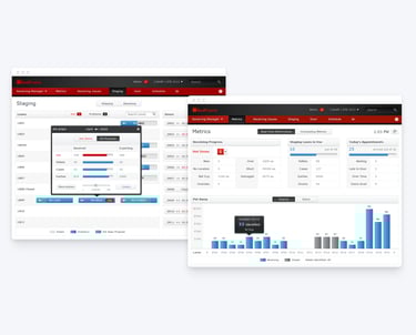
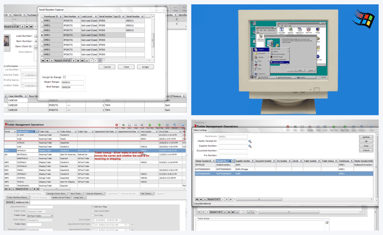
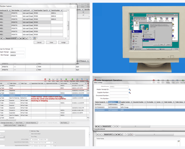
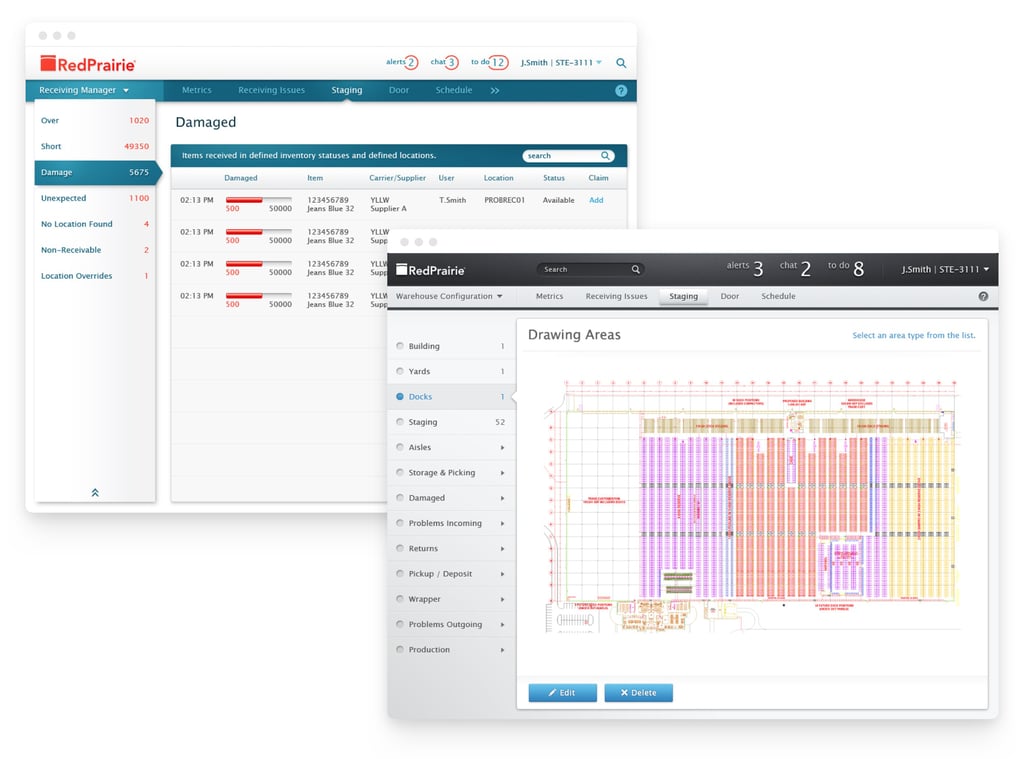
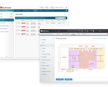
The legacy RedPrairie warehouse management app looked like something straight out of the mid-90s (think Windows 95) – all solid gray screens, countless menus, and users buried under clicks just to complete simple tasks. My initial strategy was to dramatically simplify the experience. This meant cleaning up and unifying the UI patterns, streamlining complex workflows, and ensuring the user was immediately presented with the most useful information, all while significantly reducing the number of necessary clicks.
ROLE
Product Designer
RedPrairie App
Redesign
TIMELINE
6 weeks
TEAM
Business Analysis, Tech Lead,
Myself (Design Lead)
GOAL
Cleaned up the legacy UI patterns, simplified the layout, and focused on getting useful information in front of users fast.
Trying to use these apps is a constant headache. The whole experience is so confusing – it feels like the system is actively working against me. It's an absolute cognitive burden just to get my job done.
DHL Warehouse Manager
Ideation
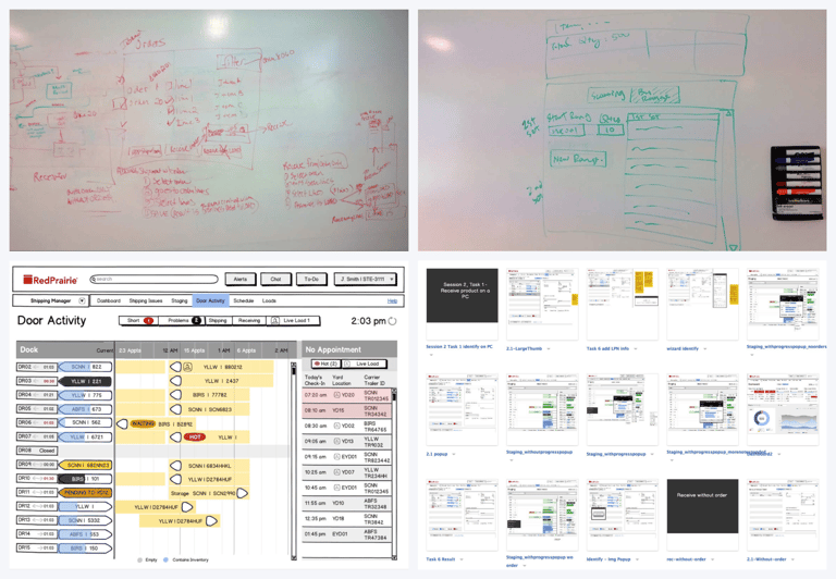
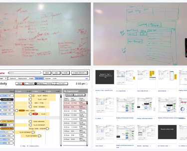
During ideation, my PM and I would huddle in a war room, mapping out use cases and brainstorming on the whiteboard with quick sketches. This process helped us build early alignment and clarity. From those sketches, I created wireframes to outline key user flows and layouts – laying the foundation for the rest of the app. Conversations with users helped refine the initial feature set, and we validated the UX through usability testing with clickable wireframe prototypes to ensure everything felt intuitive and easy to use.
Before diving into high-fidelity design explorations, my PM and I interviewed users with open-ended questions to understand how they perceived the RedPrairie product. We kept hearing words like “modern,” “sophisticated,” “simple,” and “more color.” These insights helped us understand the emotions users wanted the product to evoke and inspired the visual direction for our design explorations.
Early Visual Design Explorations
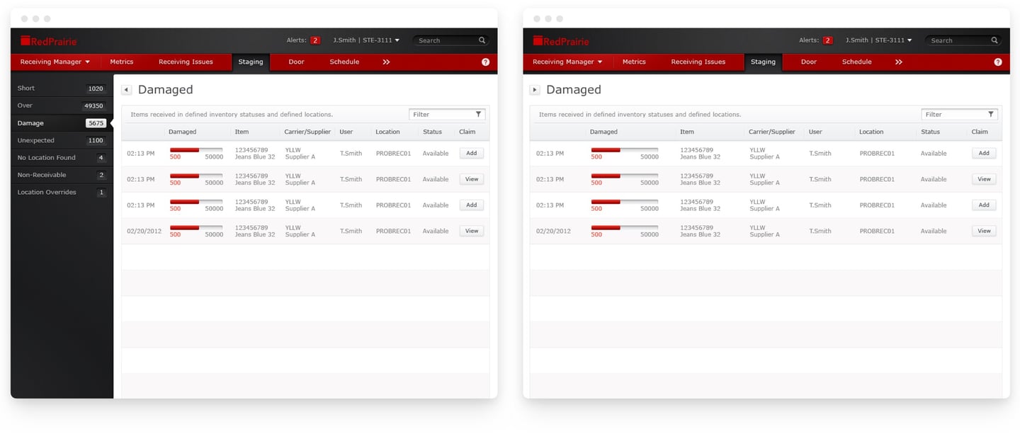

The early design explorations focused on layout and structure to ensure the right hierarchy and clarity for each element. As the design evolved, I introduced RedPrairie’s brand colors—red for energy and quick decisions, and black for strength and sophistication. Along with visual updates, I also refined the app’s functionality and user experience. Personally, I preferred an earlier blue-and-gray concept, but customer surveys showed a stronger preference for the red-and-black version, so we moved forward with that direction.
Refinement
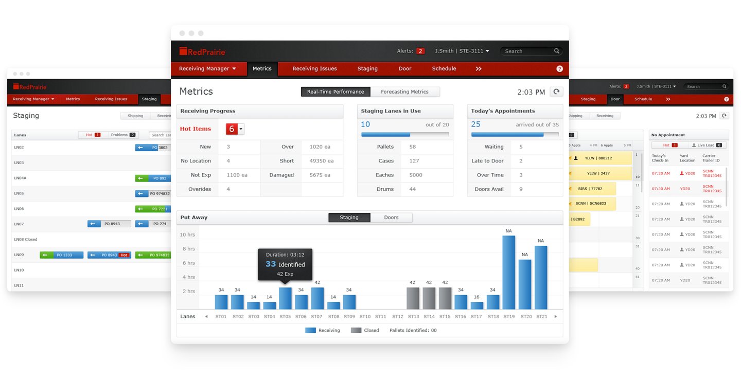
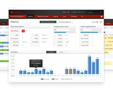
I kept the visual style clean and understated, using simple icons, smooth lines, a minimal color palette, and clear text treatments. This approach created a fresh, focused workspace that helped users stay productive.
Final Design
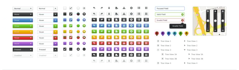
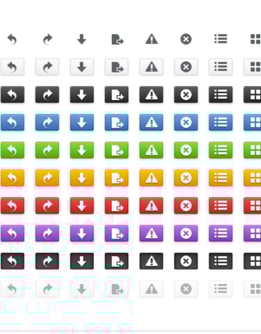
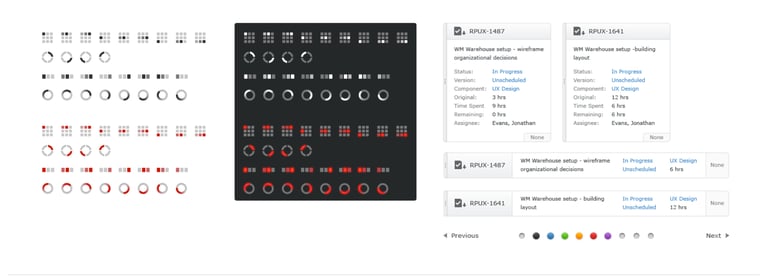
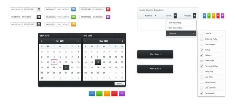
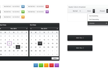
As for the in-house designers, a GUI kit was created to help designers to adapt to the new look and feel, and allowed them to easily apply all of the UI components into their designs across products. This refreshed design signaled RedPrairie’s commitment to embracing modern technology and staying ahead of the curve.