Project Overview
As part of a larger rebrand project, I was tasked with redesigning the Salesforce Lightning Design System (SLDS) homepage, and creating a series of illustrations to replace the existing visuals on the Lightning Design System website.
ROLE
Product Designer / Art Direction
Salesforce Lightning Design System Illustrations
TIMELINE
8 Weeks
TEAM
Salesforce Design System UX
GOAL
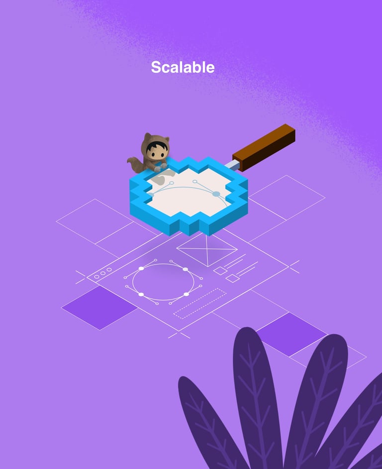
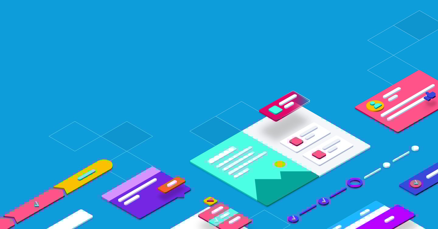
Create a bold new illustration style for the Lightning Design System, bringing vibrant, approachable visuals that redefined SLDS’s brand as fun, modern, and scalable.
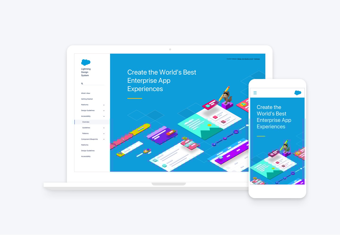
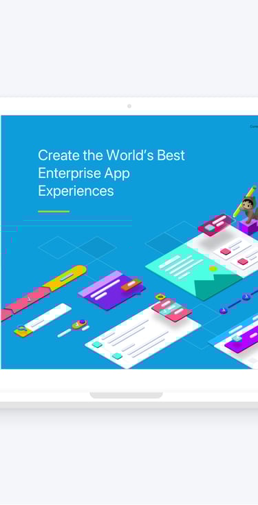
To truly position the Salesforce Lightning Design System (SLDS) as the industry leader it is, our primary goal was to achieve a brand presence that felt simultaneously fun and highly approachable. We achieved this by significantly expanding the existing visual design language. This involved introducing a palette of more vibrant colors and developing a comprehensive library of isometric UI component illustrations.
The illustrations were specifically designed to effectively showcase how SLDS empowers our clients to achieve massive scale while building robust, accessible products. This distinctive new visual style first debuted at Salesforce’s major TrailheaDX developer conference and has since been fully integrated as a core, recognizable part of the SLDS's entire online and external presence.
SLDS Homepage