
Project Overview
Desk.com was a customer service application for small business and fast-growing companies and startups. After the Salesforce acquisition, Desk.com saw huge growth in new trial users – but only a small 6% were converting to paid customers. As the designer responsible for the admin and onboarding experience, it was my top priority to improve the trial experience and boost that critical conversion rate.
Discover and Analyze
Target Audience
Our key audience are the new users and purchasing decision makers: mostly tech-savvy CEOs and small-to-medium business owners who were exploring the product to decide if it was the right fit. To keep our design decisions focused, I created a core persona:
Marcus, the Tech-Savvy CEO: Marcus recently raised a funding round and quickly grew his company to ten people. He is currently checking out Desk.com because his team needs a solution to streamline their process for handling inbound customer requests.
ROLE
Product Designer
Contextual Help Sidebar – Boosting Trial Conversion
TIMELINE
8 weeks
TEAM
PM, Myself (Design Lead)
GOAL
To increase Desk.com’s conversion rate
by providing new / trial users a fun and engaging setup experience.
Project Objective
Now that we know exactly who we're designing for, here is the challenge we faced: While our 6% conversion rate was respectable by industry standards, it meant that over 90% of trial users still weren't converting to paid customers. This presented a massive opportunity for improvement! So, I decided to dig deeper, as I knew that optimizing the trial experience was the most direct way to boost that conversion rate.
Usage Data
When a user signs up for a trial, we provide a list of recommended features we want them to set up. Our goal is simple: to help them fully experience how powerful Desk.com is, streamline their processes, and provide better customer support.
By analyzing the usage data revealed a striking pattern: trial users who converted to paid customers had a feature setup completion rate of over 80%! This immediately became our guiding principle: The more features a trial user successfully sets up and uses, the higher the likelihood they will become a future paying customer.
Proposed Solutions
The usage data gave us fantastic insights into how to improve the conversion rate. To validate our findings and initial ideas, my Product Manager and I also interviewed a lot of users. After all that discovery, we narrowed our proposed solutions down to two key concepts:
A reward system for engagement
There are two types of support agents, full-time (charged by headcount) and part-time (charged by usage time, or "Flex Hours"). Flex Hours are a hugely popular feature because, in smaller companies, employees often wear multiple hats and frequently help out with customer support.
Our idea was to use this popularity as motivation: every time a trial user completed setting up a recommended feature, they would earn Flex Hours. This would encourage engagement and feature setup.An Interactive step-by-step setup instructions
During our interviews, we asked users how they typically set up recommended features. We discovered that most users were opening two browser windows – one for the Desk.com admin interface and another for the setup guide – constantly toggling back and forth. This was clearly time-consuming and not user-friendly.
After some focused whiteboarding and brainstorming, we realized we could combine the best parts of both ideas into a single, cohesive solution: the Contextual Help Sidebar!
Ideate & Design
Following our initial white-boarding sessions, I quickly mapped out the basic feature flow and created high-fidelity mockups. I then turned these into a clickable prototype, so we could immediately test the concept with real users.
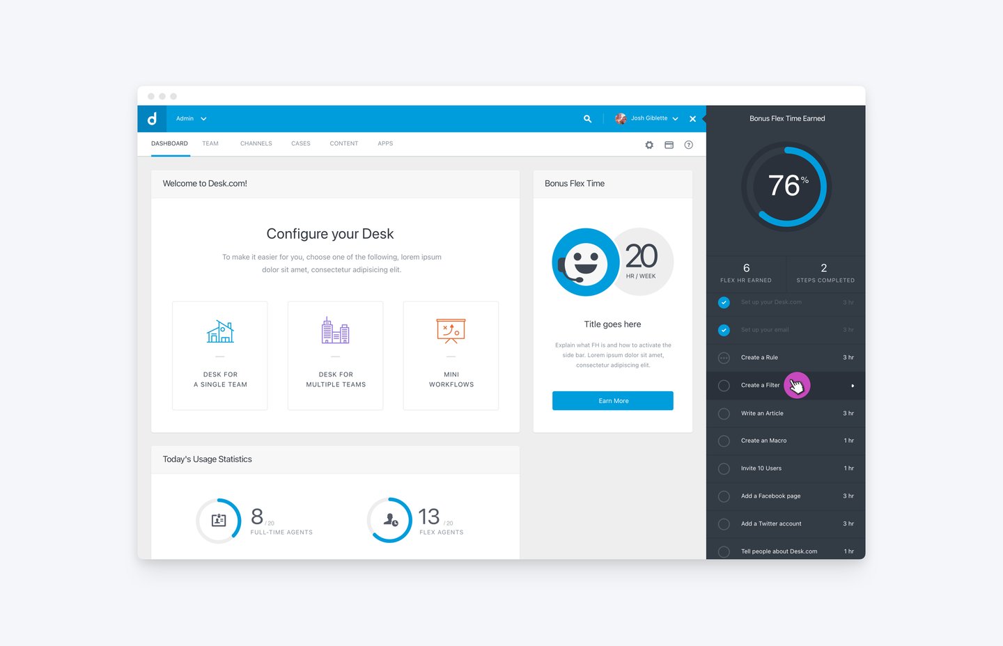
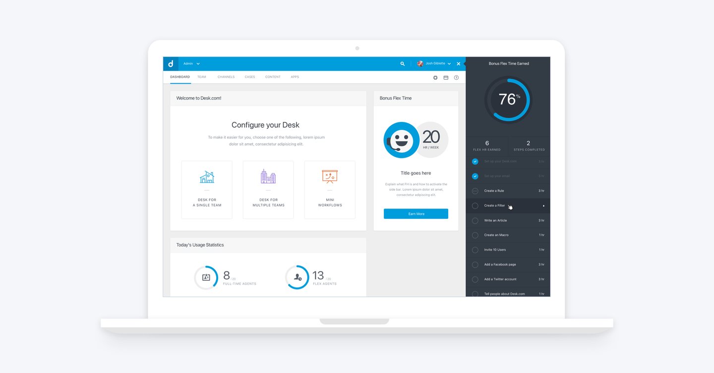
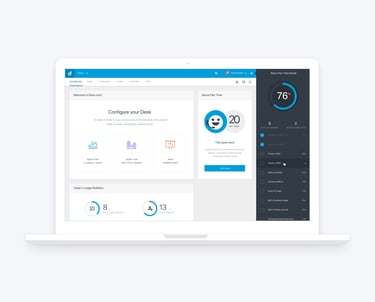
How It Works
At the top of the CHS panel, users see a Gauge that provides a quick overview of the Flex Hours they've earned. Below the gauge, the precise number of hours earned and the total count of recommended features they have completed are clearly displayed.
The sidebar also visually communicates the setup status for all recommended features:
Completed features are marked with a checkmark.
In-Progress features are marked with three dots.
To begin, users simply click on any Recommended Feature in the list to start the contextual setup flow instantly.
In this case, say a user selects 'Create a Filter.' The feature item in the sidebar instantly expands to reveal detailed instructions, and the main screen simultaneously transitions to the correct page for the user to begin setting up their Filter. Everything the user needs is brought right into context!
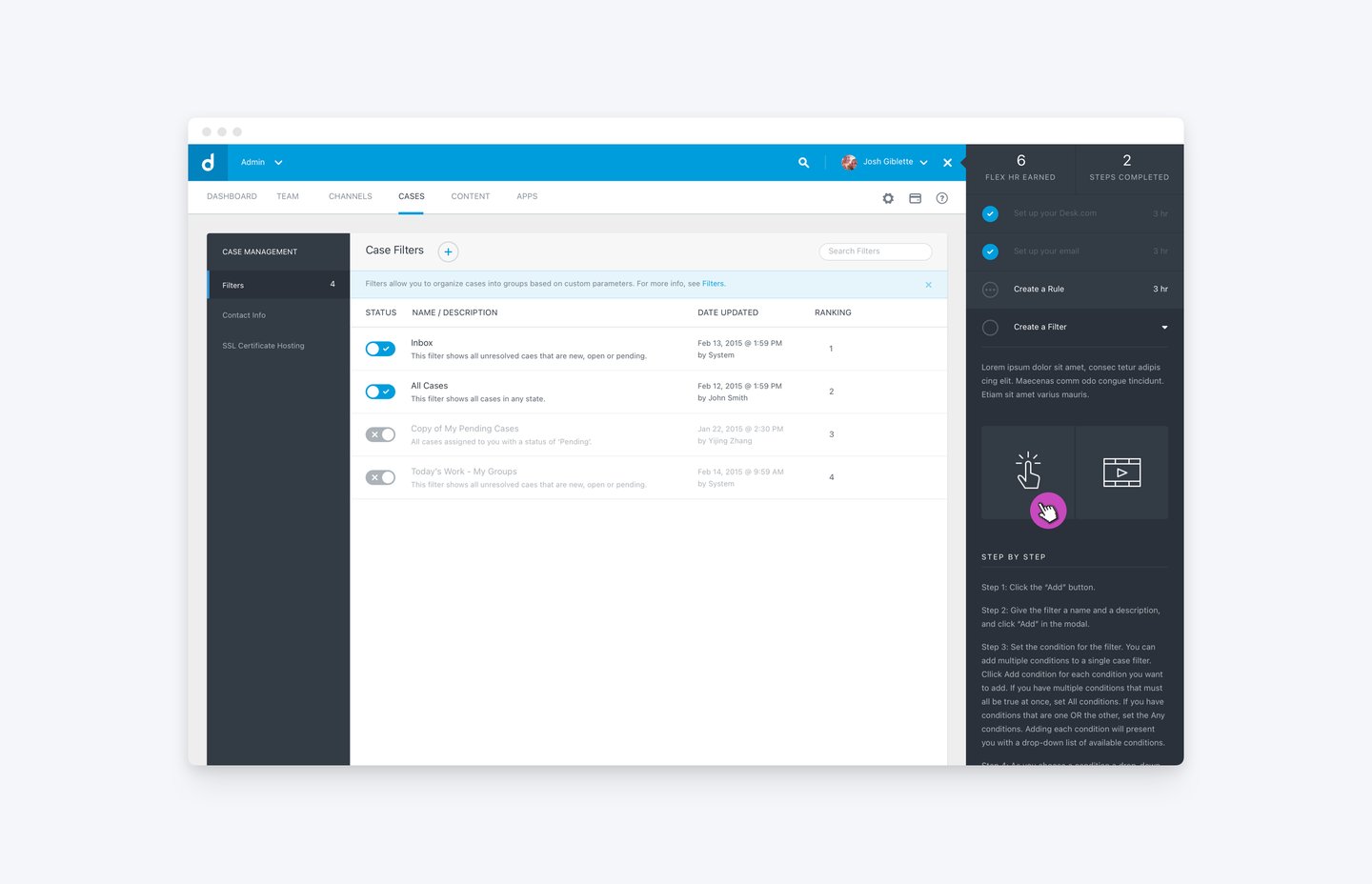
Once expanded, the panel provides a detailed feature description and offers flexible setup choices. Users can opt for an interactive, step-by-step walkthrough or watch a tutorial video. For those who prefer to read, the full written instructions are always available just below those two tiles.
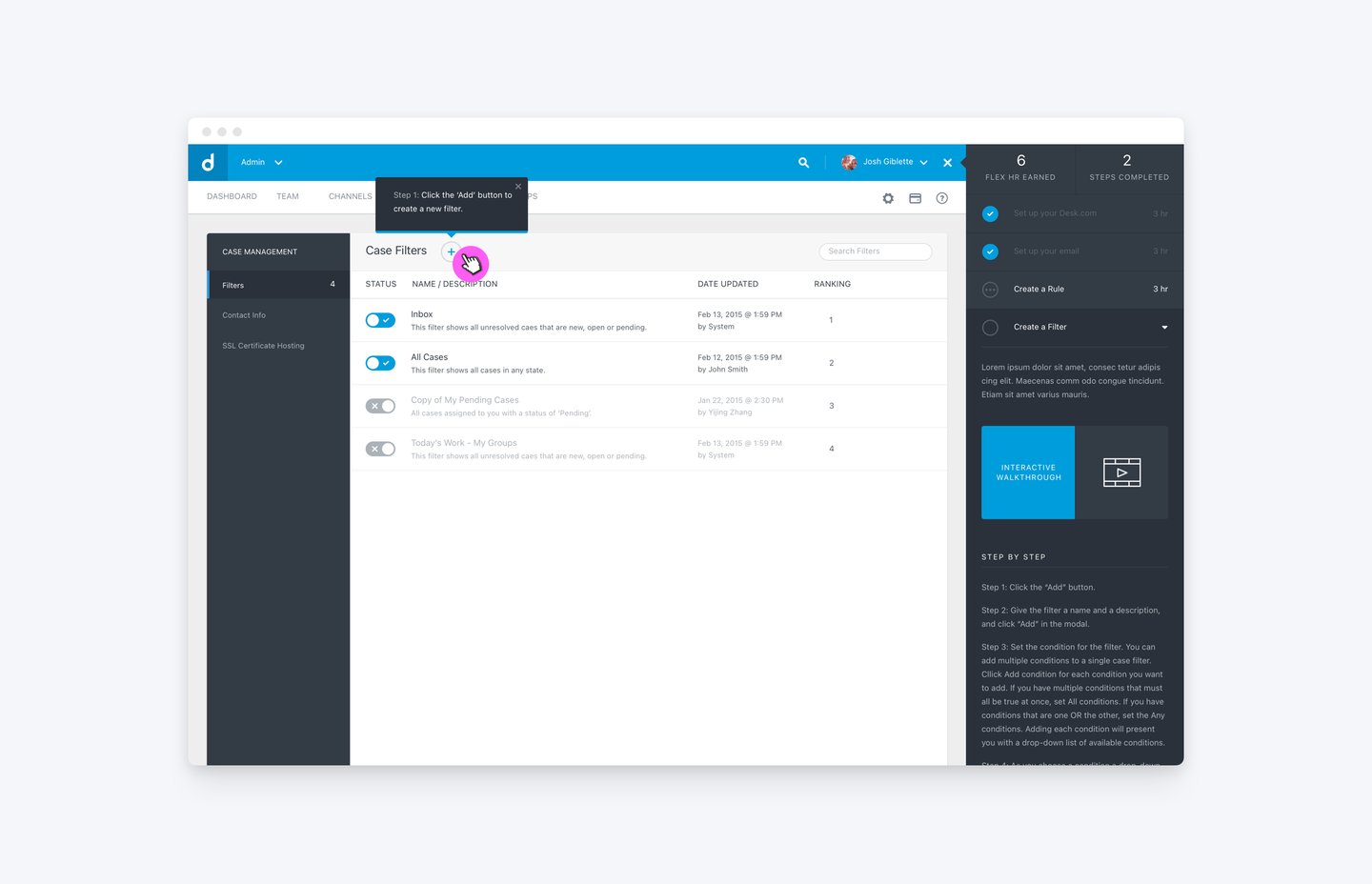
Once the user selects the interactive walkthrough, the tile changes to blue to confirm the selection. For better accessibility, I made sure we didn't rely only on color; I swapped the tile's icon for explicit text. Simultaneously, a tooltip appears directly in the main UI, clearly guiding the user on the next action they need to take. In this case, the first step is to click on the ‘Plus’ icon to add a new filter.
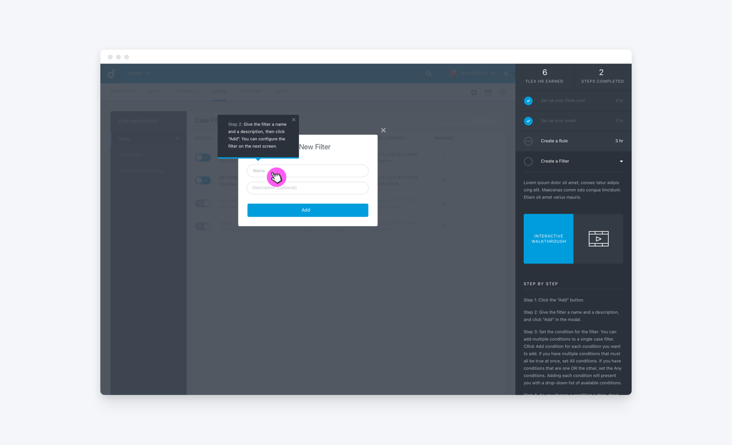
Here's how the tooltip looks when it appears over a modal. In this instance, the prompt is clearly pointing directly to the input fields where the user needs to enter a name and description for their new filter.
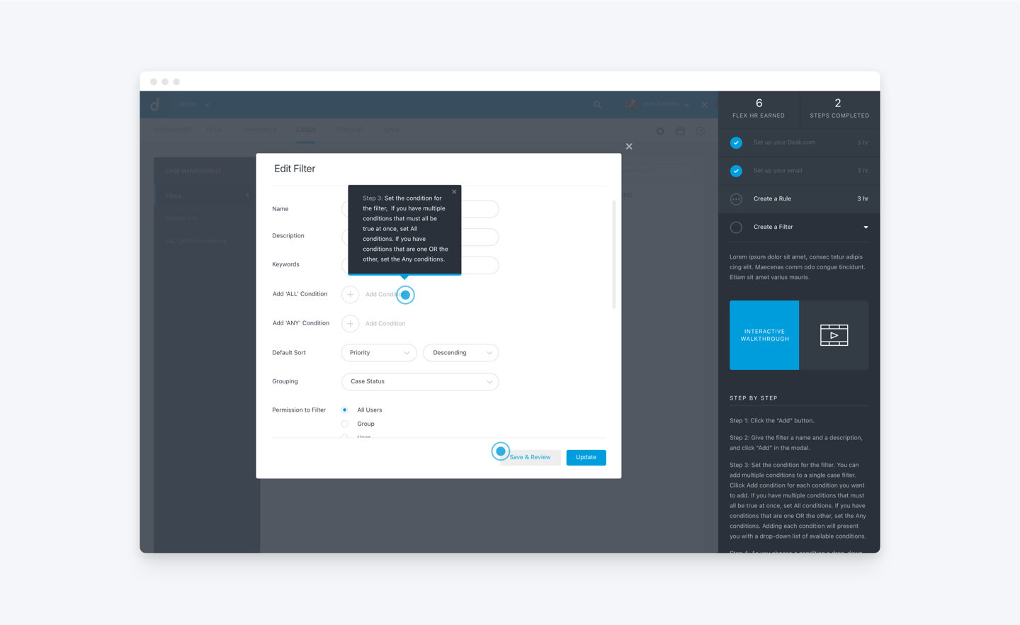
When a step has more than one required action, the UI shows it like this! We use two pulsing animations to clearly indicate all the necessary click points. The user takes the first action, and then the tooltip dynamically moves to the second pulsing area, ensuring they are always precisely guiding the user to their next action.
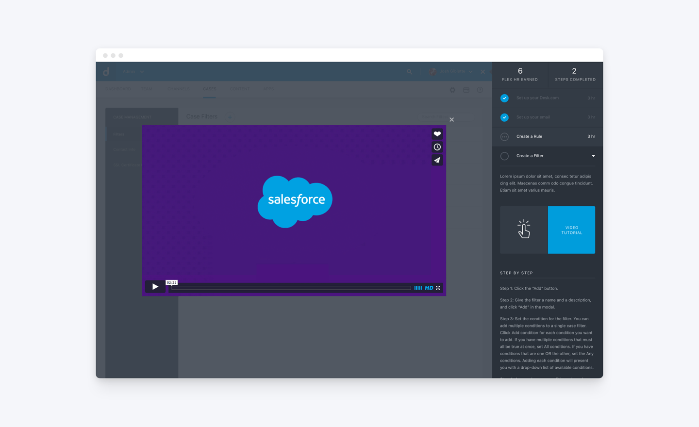
Users also have the option to watch the video tutorials our support team created. While these videos were previously scattered on Vimeo, I integrated them directly into the sidebar for easy access and choice – though this option still requires users to juggle two separate windows.
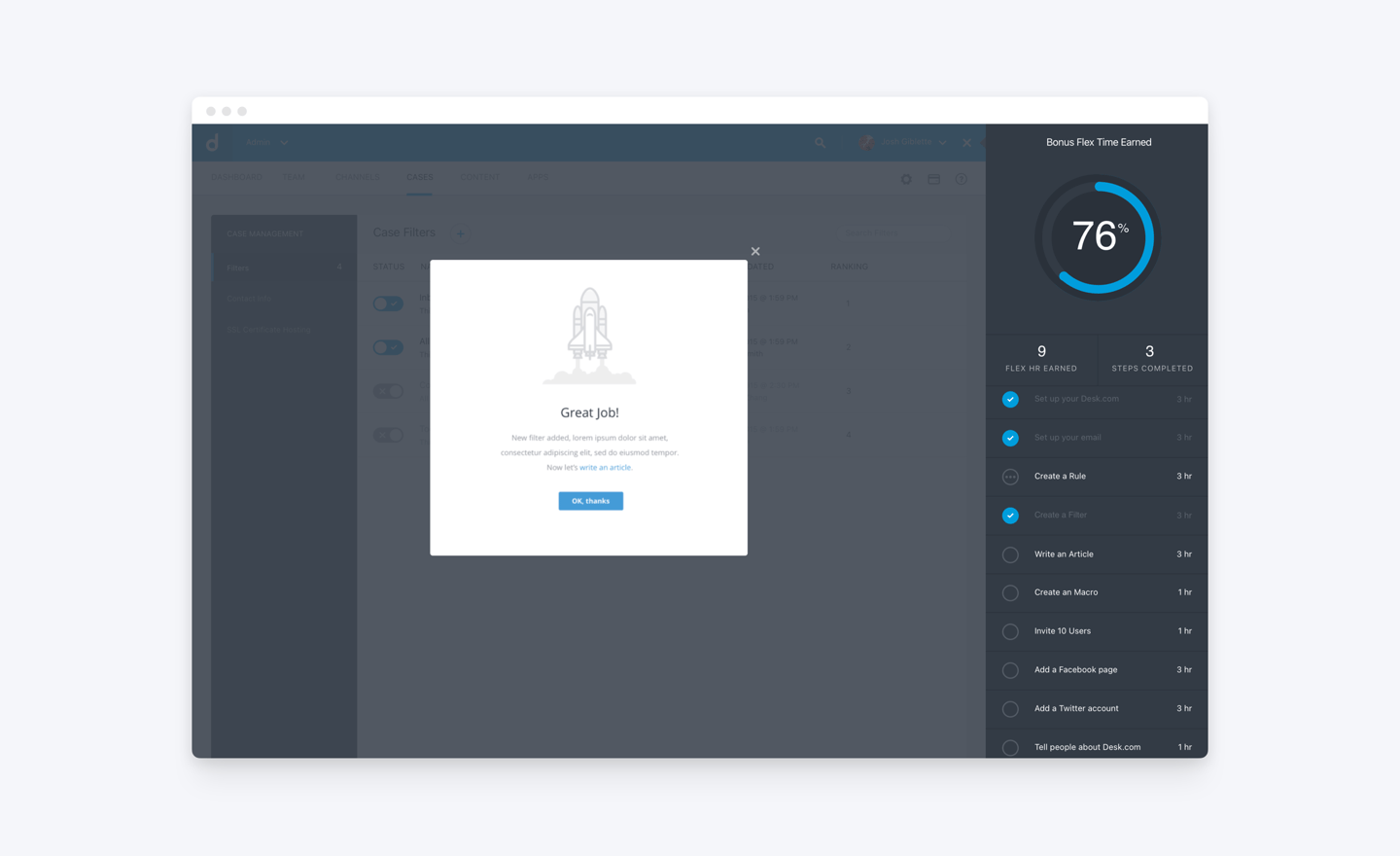
To celebrate each completed setup flow, I added a subtle illustration to celebrates the user's progress. I also included a link to make it easy for users to move on to the next recommended feature.
Outcome & Impact
The project was a huge success!
It went smoothly because we focused on upfront research and defined a clear goal. This preparation allowed us to build a powerful story for stakeholders, securing the necessary support from leadership early on.
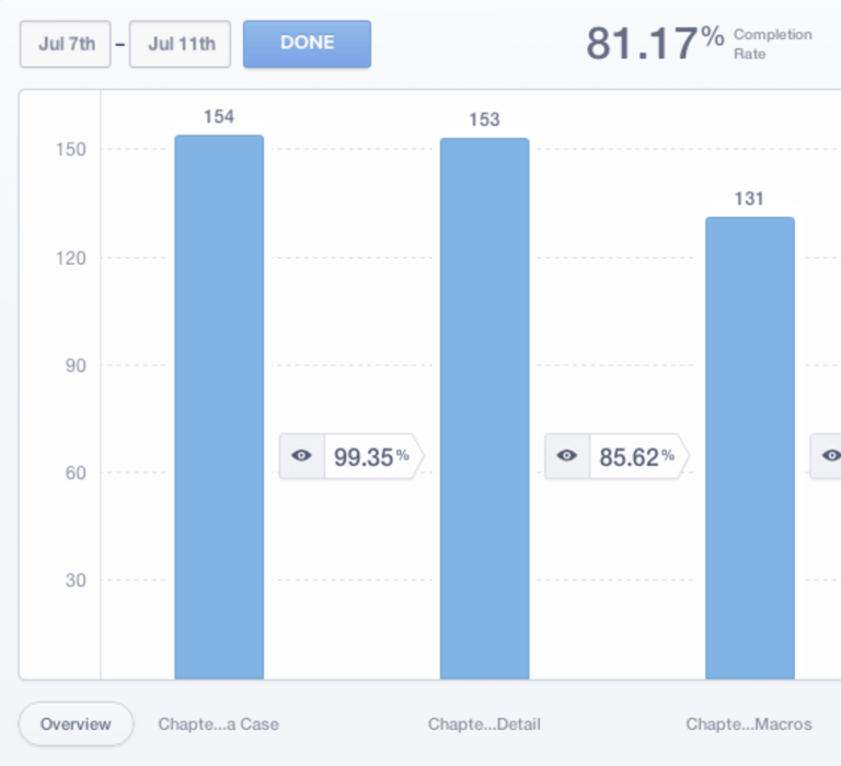
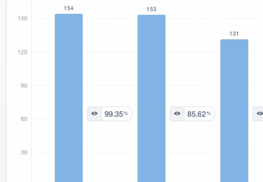
Completion rate on setting up recommended features jumped from 40% to 70%
70%
11%
CONVERSION RATE
COMPLETION REATE
% of sites that became paying customers. Almost doubled from 6% to 11%
COFFEE CONSUMED
240 oz
There were times when I consumed more than usual...
Takeaway
My biggest takeaway, however, was realizing that there's always a better way to do things if you truly listen to your users. While our old setup instructions were technically "good enough," observing how users actually completed tasks revealed the friction points. That key insight is ultimately what led us to the idea of the Contextual Help Sidebar.