
Project Overview
The Content Library in Qualified’s AI Studio was more than a storage tool – it was the knowledge foundation that powered our AI experiences. As our customer base grew, the system became cluttered and hard to use. I led the redesign to make it scalable, intuitive, and ready for future AI-driven personalization.
The Challenge
The existing Content Library had evolved into a massive, flat list of pages, PDFs, and snippets. It worked fine for smaller customers, but enterprise teams struggled to manage and organize content effectively.
ROLE
Design Lead
Powering the AI Brain: The Content Library Redesign
TIMELINE
2 Months
TEAM
PM, Engineers, Data & AI teams
GOAL
Redesign the AI Studio Content Library to make it scalable, intuitive, and ready for future AI-driven personalization.
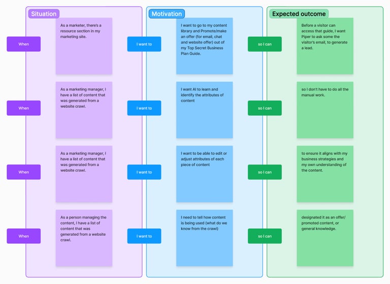
After chatting with our Customer Success (Implementation) team, we pinpointed the following key pain points:
No filtering, tagging, or categorization
Little visibility into crawl data or content usage
A dense layout that made browsing a chore
These frictions slowed down users (mostly admins), and limited how effectively our AI could surface and use content.
My Approach
I started by reframing the library as the “AI brain” – the system that stores, organizes, and feeds knowledge into conversations. To design for scale, I focused on:
Structure: introducing clear organization and metadata to make content easier to find.
Simplicity: reducing visual noise and cognitive load.
Clarity: making offers, statuses, and actions immediately understandable.
Scalability: ensuring the system could support future AI tagging and personalization.
Through user interviews and workflow mapping, I identified friction points in how admins uploaded, filtered, and managed content. My PM and I iterated on wireframes and flows (Job to be done use cases) to balance flexibility with clarity before moving into high-fidelity design.
The Design Solution
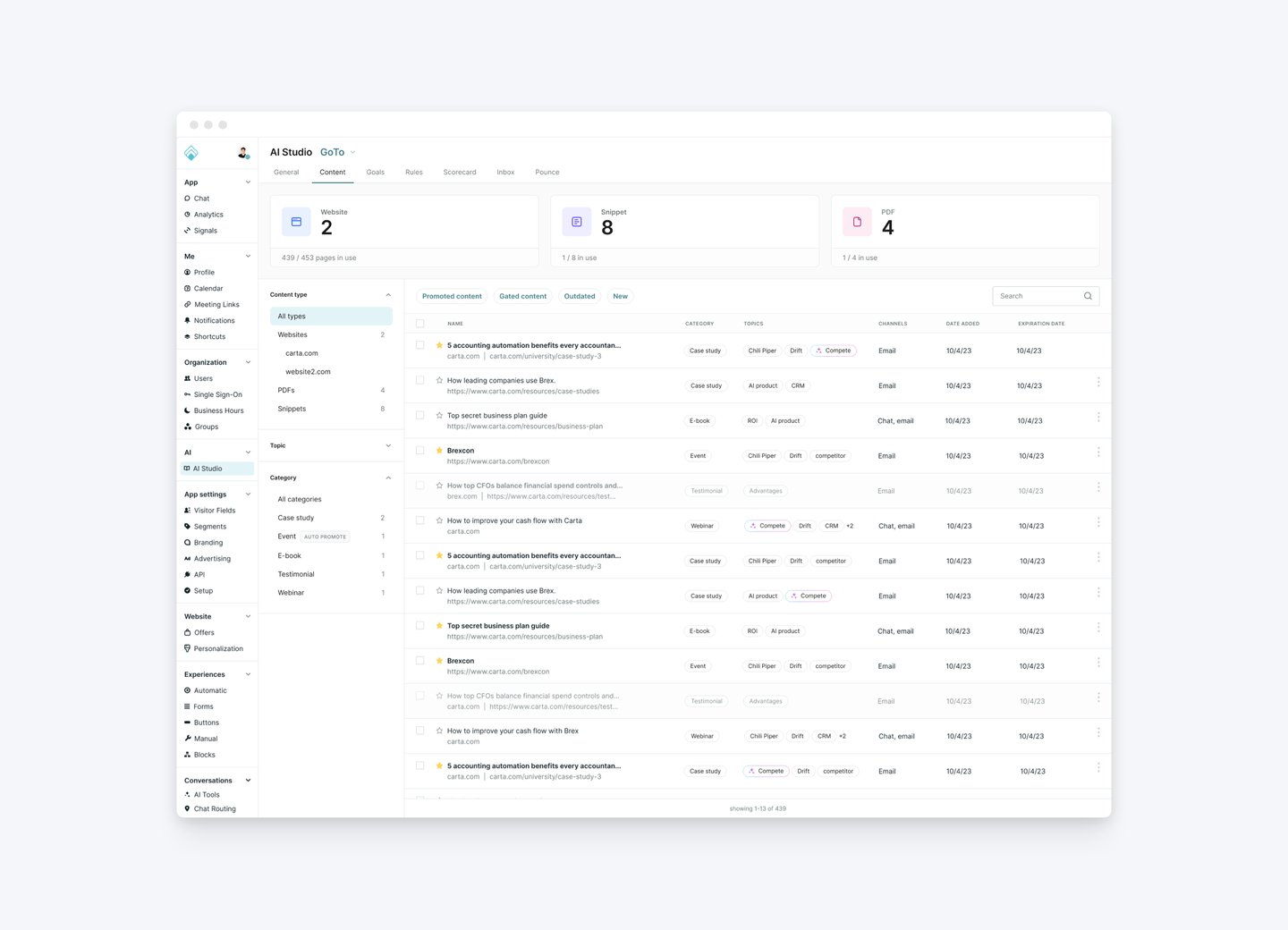
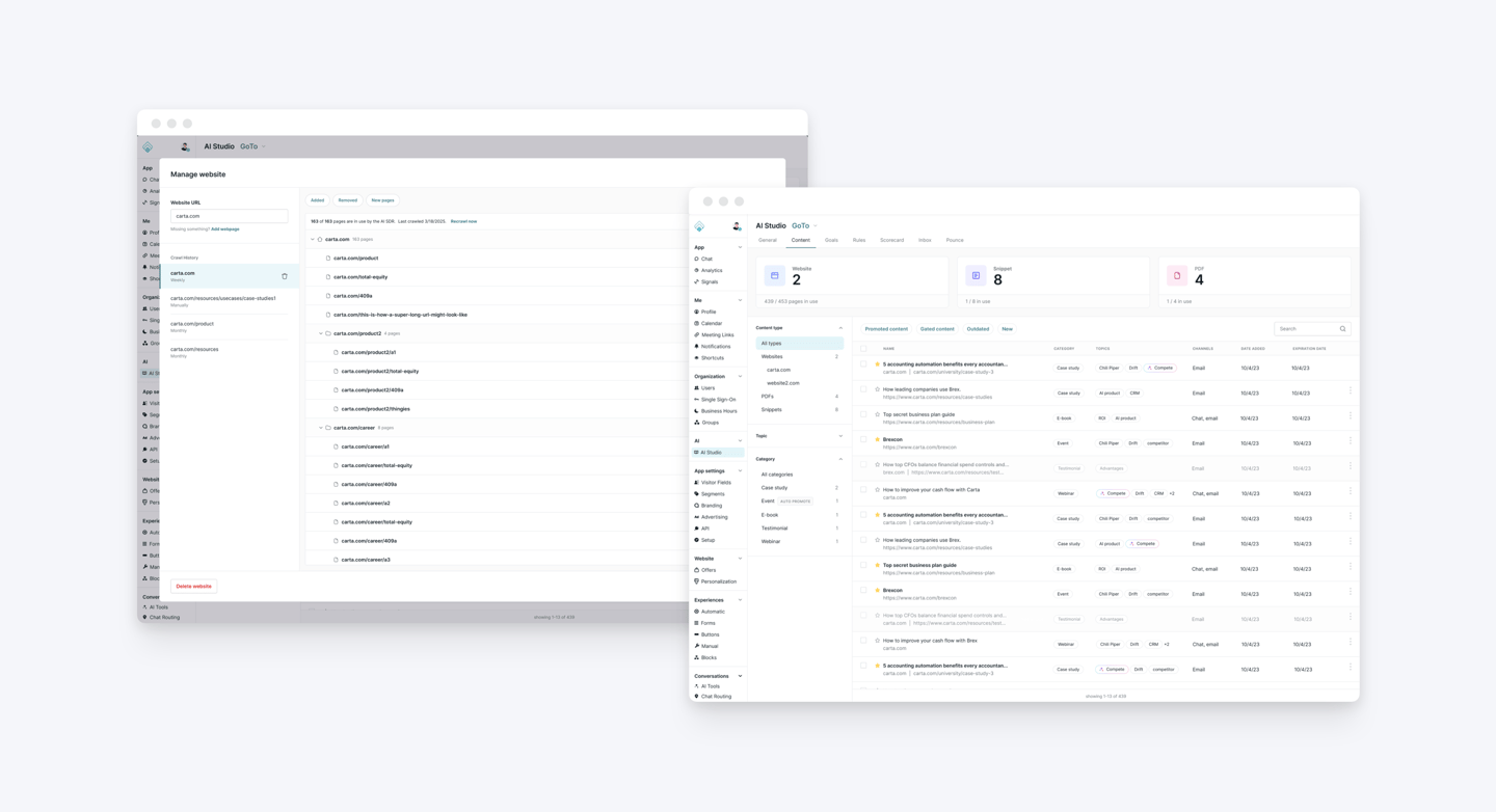
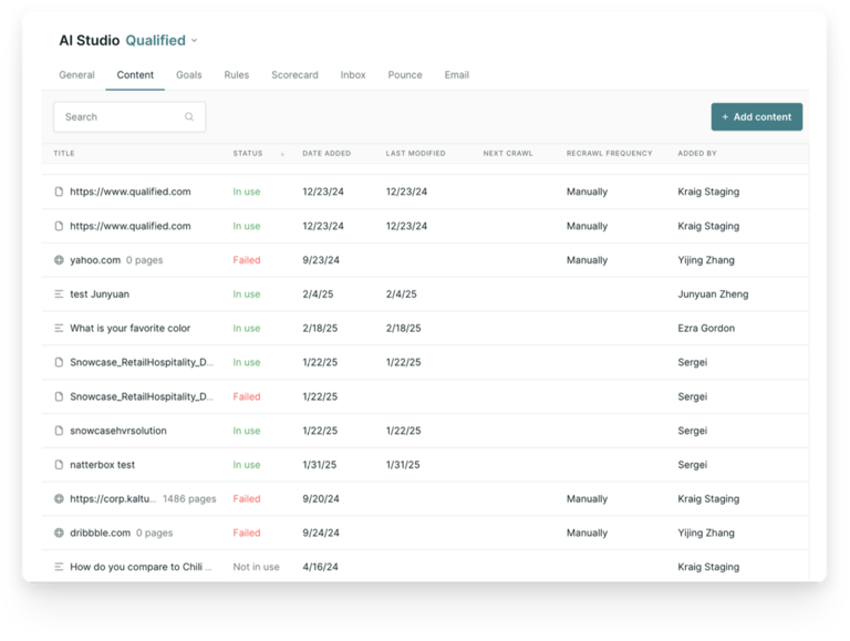
The redesigned AI Content Library transformed from a static list into a smart, structured workspace.
Advanced Filtering & Categorization: Browse content by type, topic, or status.
Offer Management Tools: Create and manage offers directly, with clear visibility into timing, audience, and purpose.
Crawl Insights: View what the crawler knows about each page and when it was last updated.
Streamlined Layout: A clean, table-based interface that’s scalable for thousands of assets.
Visually, I focused on hierarchy, contrast, and whitespace to make the interface feel lighter and more intuitive – turning complexity into clarity.
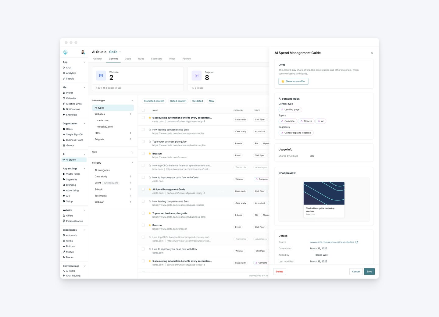
To keep the experience consistent across the app, I utilize a side panel pattern for quick edits.
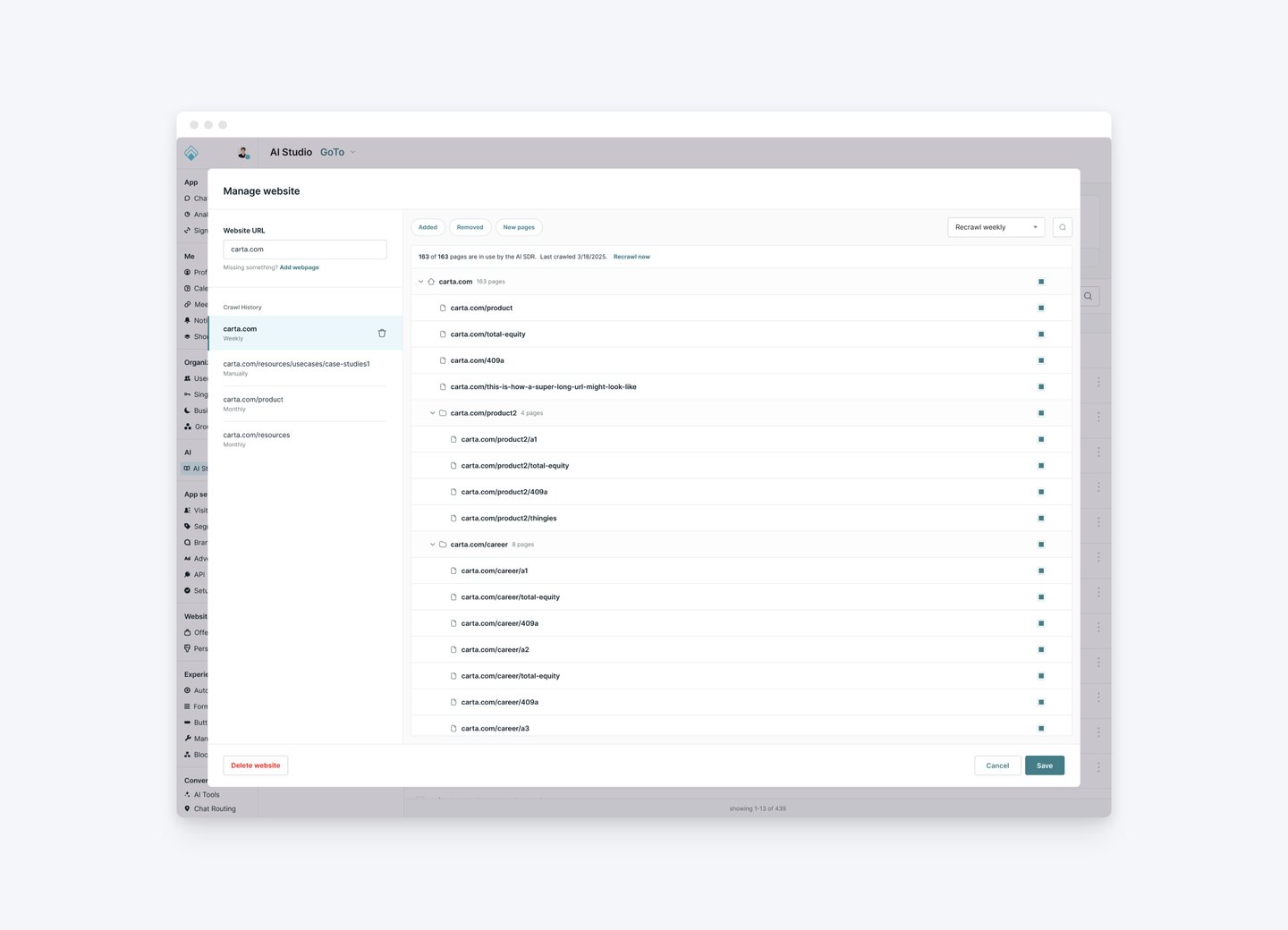
For managing complex content sources like websites, I went with a large modal window. This pattern preserves the user's context by keeping them within the main interface while they complete the complicated task.
Results & Impact
This redesign laid the groundwork for AI-driven content intelligence, becoming the core of how the platform learns and delivers relevant experiences.
Reduced content management time by half
Created a scalable structure ready for personalization and analytics features
Helped position Qualified as a leader in AI-powered sales experiences